the hamilton type museum needs our help now!

last Summer we took a little trip to the Hamilton Type Museum in Two Rivers, Wisconsin. You can read all about our lovely day here. This glorious place needs our help and needs it NOW.

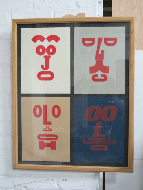
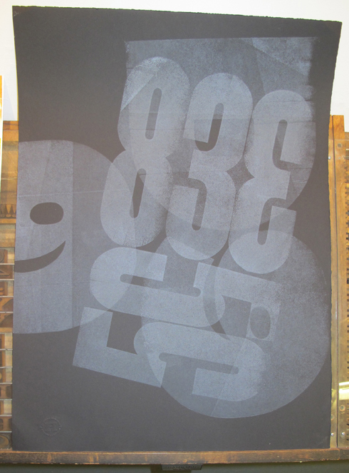
The Hamilton Wood Type Museum is the only museum dedicated to the preservation, study, production and printing of wood type. With over 1.5 million pieces of wood type and historical equipment in their collection.

This is the time of the year that people tend to think about giving. Plz consider giving to them as they are in the process of raising $250,000 for the move and a building of their own.

From the Hamilton website: Help! Hamilton is being forced to move mid-February. The owners of our building, Thermo Fisher Scientific, have given us 90 days to pack and vacate the building. We have little or no money to do this and no place to move to. We are attempting to raise $250,000 in short order to get 30,000 sq. feet of printing history packed up and ready for a new home, wherever that may be. PLEASE consider a donation today. If you're in the creative field let your employer know we need them as well. They can contact artistic director Bill Moran at Bill@woodtype.org to learn more. You can download a donation form here or click here to give online.

When we were there on one of the hottest days of the Summer I could only think how amazed I was that this place even existed. And without our help they might not. Please do whatever you can.

Please share this post on Facebook. This is important to all of us in the graphics field.

cajun christmas


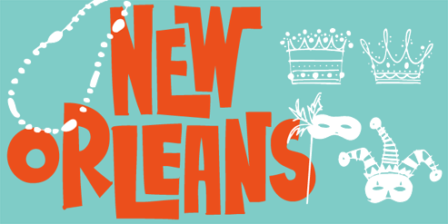
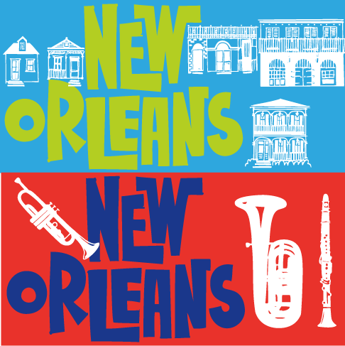
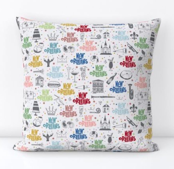
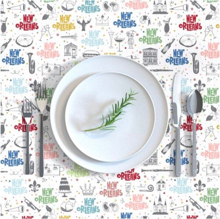
i did not create this amazing New Orleans holiday card but Jenn from Seahorse Bend Press did using my New Orleans Doodles as the artwork. Nothing makes me happier than to see my illustrations used so well by someone else. If you need some you can email her at help@seahorsebendpress.com and tell her Rae sent you. She will also have cards for Texas, Maine, Boston, New York, San Francisco and Chicago.

(Great job Jenn!)

free font time!


Most of you are arriving here because of the quarterly newsletter (if not the link is on the right if you want to sign up). This quarter's free font is Nancy Vala's Vibrant Women. It will available for a limited time. To get this font for free click on the red link on the right. Normal licensing applies. And if you like the birthday girl above you can order some cards from Nancy's etsy store. It's my favorite birthday card.
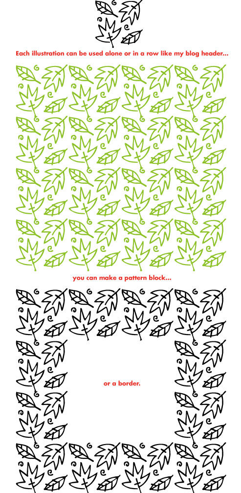
Just released is Flower and Leaf Borders. I am excited about this simple, easy-to-use font. 30 different flowers and or leaves. Lots to work with.
 

This font was not designed for Word. I use Illustrator a lot and this is a great font for graphics programs. To make a pattern block your program must allow you to control your line spacing and kerning. If you want to use this font in Word and are more skilled than I am maybe you know how to do that. Otherwise I would suggest using it as a spot illustration or in a row as I did for my blog header. Just a tip, I made the border by taking the same art from the pattern block and changing the color of the middle 4 illustrations to white. Very quick and easy and it meant that everything lined up exactly.


And here is a new city font, New Orleans Doodles! It is almost as much fun as a trip to NOLA. Food, drink, Mardi Gras, musical instruments and buildings. This font has more illustrations than usual, I just could not stop drawing.

The next font will be Christmas Borders. Can't wait to get started on that. Stop back here to see the progress or LIKE me on my Facebook page for updates.

Happy Fall!

what is on the drawing board...


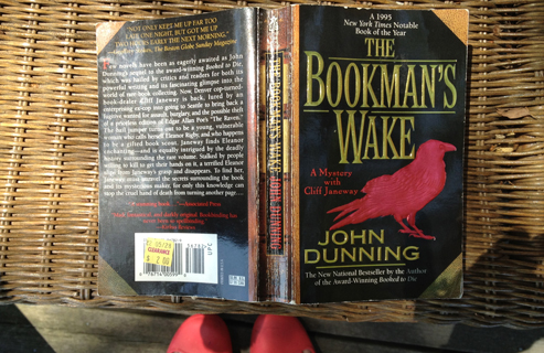
Started a new font this week and at the same time started this book which I am unfortunately just gobbling up. My font making friend Nancy sent it to me because she thought I would like it and I do. It is a murder mystery (which I rarely read) that includes rare book collecting, printing and designing of typefaces used in those books. I love the small sections where the author talks about type in the same way I think about type. Makes me think of our recent trip to the Hamilton Type Museum.

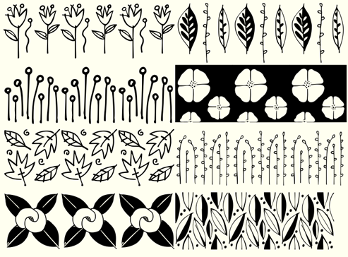
And I have a nice start to this new Flower & Leaf Border font. This shows 8 letters. Each letter is in this case typed 3 times to get the repeat. This is still in the rough stages and it will change as I go along. I will also add a second piece to each that will be a mask. That would allow someone to type 'a' and add a color to it and then type "A" and have the line drawing stack on top of the colored mask. Or at least that is what I am thinking now. This would be an open type feature and I don't know how to do that part right now. Right now I am in the fun creative drawing part of the font.

A while ago I posted this painting with just the peacock background color on it. This is a close up of a small section I like. It is about 2' x 4'. I think I need some marigold color somewhere. In the mean time it is a nice splash of color in the stairwell.

John has a nice project of his own going that I am doing a few little things for. He is making a Little Library that will look like our condo and be in our front yard. Our deadline for that is later this month, I'll blog about that when it is done.

stay-cation days 8 & 9 & the hamilton type museum!


we ended our week with a little over nighter. Saturday we drove to my hometown to my niece's graduation party. After than we drove to Manitowoc, WI. We got there just before sunset and dipped our toes in Lake Michigan. The next morning we drove a couples miles to Two Rivers to see the...

Hamilton Type Museum (photo from their website). In the 1880s this then 4 story building was one of the 3 companies that made wood type for letterpress printing. Stephanie Carpenter the Assistant Director gave us a very informative 1.5 hour tour.

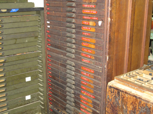
This is a section of the Guinness Book of Record's Longest Wall of Type.

The number 2 is their largest piece of type. It is in 2 pieces and it takes 4 people to print it.

Matthew Carter is working with Hamilton and is designing a typeface for them. This is a 2 color font. The black is one and the red is the other color. He will design on a computer and they will print the letters and then trace and cut them from the wood.

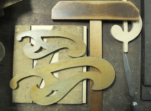
I was crazy about these beautiful wooden curves.

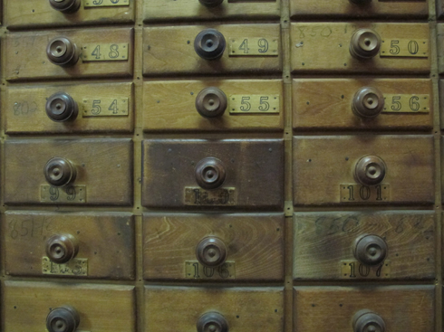
And all of these drawers. So many drawers, so hot, so little time.

Here is an old linotype machine. While they only ever made wood type this was still very interesting to see there. On my second job this is how type was set. They would set the metal type and pull a proof and I would paste that up. I know, way back in the olden days. This was even obsolete at that point in time.

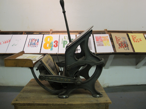
This little press would be sweet in my office.

I enjoyed every minute of being there. If I lived in Two Rivers I would volunteer there because it is such a wonderful place to be. They have barrels of donated wood type that needs sorting. I would volunteer to sort the barrel of punctuation and try and figure out what font it would go with.

Since I could not do that I settled for a t-shirt and a poster and we headed out for home. If you are in the Two Rivers, WI area I would not miss this.

new font... new orleans doodles

finally. Done. And today on sale at myfonts.com. By the end of next week it will be for sale everywhere else. This font practically drew itself and then I just could not generate it. Might be because there are 40 illustrations instead of the usual 30 I don't know. It is working and that is all I care about.

Now I can move on to the Flower Border font that is dancing in my head.

free font, new fonts and a giveaway!


The FREE font this quarter is Drop Cap One! I use this font as a webfont for the initial caps for my posts.

Drop Cap One is a drop cap or an initial cap font. Even though it has all the letters of the alphabet it is not an alphabet font to be used for headlines or body copy. It has no kerning or punctuation except a period. It does not have accent marks.

There are basically 2 alphabets in this font. The lighter letters are lower case and the darker letters are upper case. The light and dark letters are interchangeable. While a fun desktop font the real inspiration for this font was my need for a webfont for initial caps for blogging. It could also make a great scrap booking font too. Lots of uses for this quirky little font. The free font is a desktop font. If you want it as a webfont  click on the webfonts bar on the right. That font is not free though.

To get this font for free click on the red bar on the right.

Normal licensing applies. You cannot give or sell or share this font in any way.

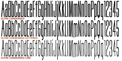
I've spent the Spring working on this 3 font family... Ultra Condensed is has a full character set. Ultra Condensed is a remastering of Tall Skinny Condensed from 1999 which continues to be a best selling favorite. While similar the fonts are not interchangeable. Shapes of some letters have changed, kerning and spacing are different. Tall Skinny Condensed does not have a full character set.

And everyone likes a hand lettered font. So next I then used the same shapes from Ultra Condensed but hand lettered it. Ultra Condensed Lettered has the same feel as Ultra Condensed but without the hard edged feel. It is softer and friendlier.

Ultra Condensed Line also hand lettered, is a thinner version of Ultra Condensed Lettered.

These 3 fonts work well together or with a non condensed font, great for headlines at a large size. Works well for lots of copy in a small space.

Fonts are $29 each or all three for $49.

Yes I thought I'd try something new. You can win the 3 new fonts by doing the following...

Go to the Outside the Line business Facebook page here.

1. LIKE the Outside the Line page if you have not already.

2. LIKE the post about the Giveaway.

Winner will be chosen by random from those who have LIKED us.

And if you have already bought the 3 new fonts you can choose another 3!

new! ultra condensed font family

it feels like I have been working on this font family for months and that is because I have been. An alphabet font always takes a lot more time than a doodle font. The technical part is so much more involved. A doodle font has 30-50 illustrations but an alphabet font has 256 characters. And then those characters must be spaced and kerned. But I have a lot of alphabet fonts in my head trying to get out. So I will be working hard on those this year.

Ultra Condensed is a 3 font family with a full character set. Ultra Condensed is a remastering of Tall Skinny Condensed from 1999 which continues to be a best selling favorite. While similar the fonts are not interchangeable. Shapes of some letters have changed, kerning and spacing are different. Tall Skinny Condensed does not have a full character set.

And everyone likes a hand lettered font. So next I then used the same shapes from Ultra Condensed but hand lettered it. Ultra Condensed Lettered has the same feel as Ultra Condensed but without the hard edged feel. It is softer and friendlier.

Ultra Condensed Line also hand lettered, is a thinner version of Ultra Condensed Lettered.

These 3 fonts work well together or with a non condensed font, great for headlines at a large size. Works well for lots of copy in a small space.

Whew... and now on to New Orleans Doodles. It will fun to get back to drawing more and working on the computer less.