A new year, a new month, a new font!
/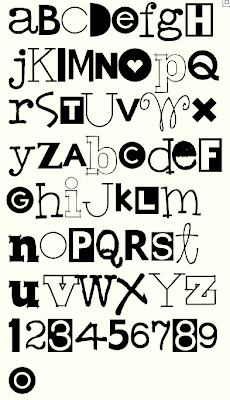 This month's font is called Hodgepodge for obvious reasons. I know, I know you are probably thinking that this font has been done. And it has. But not the way I always think it should have been done. I often have a need for this type of font and never liked those available. And this font has been in my head while I have made 30 other fonts. I have a monthly creative lunch with my friend Justine. She actually mentioned needing this font and didn't think the existing ones worked for her either. She gave me permission to get over the fact that it has been done and do it as I saw fit.
This is a headline font. You type a headline and then play around with the letters so you have a nice mix of light and dark, thick and thin, outline and solid.
And a great example of this font will be my redesigned website when I get that done.
Next month's font will be Dear John. The first in my Love Letters series.
Rae

