Today I have a guest blogger! Nancy is an artist and writer and more recently a yogini and a new font designer. She is going to share her process for font making... Since Nancy is a very interesting person she also has a very interesting blog...
Walking Satellite, do check it out.

Making a Yoga Font
It starts with the feet. Doing yoga and understanding the poses in a physical way makes it easier to draw them. Although I have to admit that I did illustrate a yoga book many years ago when I was just a beginning yoga student. Gentle Yoga, still in print. But I had my teacher, Lorna Bell (who is 68 and still doing Scorpion and headstands) standing over me and pointing out every little thing that needed to be adjusted to make the drawing, and the pose, better. Just noticed that my feet look kind of ugly, maybe I should have Photoshopped them!

Research. Research. Research. I have a small library of yoga books. The ones I refer to the most are anatomy books and "Light on Yoga" by B.K.S. Iyengar because it is so specific and precise. Online I look at YogaJournal.com. The internet is full of photos of poses badly done -- kind of scary to think that people are going by these images.

If I'm lucky I will find a good image to look at. This one is from Yoga Journal and she is doing the pose beautifully. But I wanted to draw a man doing Triangle Pose/Trikonasana. So I found another pose, with a guy:

This pose is not quite as well done as you can see by comparing the two. If I were his teacher, I would ask him to make sure the heel of the front foot is lined up with the inner arch of the back foot, inhale and sink deeper, without the block.

Then I make a sketch, bringing everything together. It gets scanned into my computer and then I go to work, drawing with a program called Adobe Illustrator which is basically making a series of connected dots and bending and manipulating the lines into curves, etc.

And here is the finished product as a line drawing
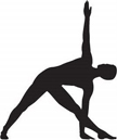
and as a filled, black drawing:

There are so many different kinds of yoga but still some very basic poses that they all use and these will form the yoga font: mountain pose, forward bend, down dog, triangle and more -- each pose will have a line version and a filled version. Each pose will correspond to a letter on the keyboard: type "A" to see Lotus position or "B" for mountain pose, for instance. If you know what 'dingbats' are -- same idea. The characters will come with a chart with English and Sanskrit: Virabhradasana, Trikonasana, Tadasana . . . I love the Sanskrit words. It is an ancient, supposedly vibrationally pure language which I imagine is why it is so beautiful when chanted.
And then it goes to my friend Rae, font designer extraordinaire! with 62 cool fonts under her belt. Some of you get her free font every month, some of you are still clueless -- click on the link above to see what's cool and free this month. She uses her expertise to turn my drawings into a font.
Yoga Studio. That's the name of the font and it should be out sometime in July. Stay tuned to the blog for the official debut.
 I just got these samples in the mail this week from Jessica at Jack & Ella Paper Press. If you like my fonts and you like paper products like I do you must check out her etsy shop.


