font friday... 2011 typodarium calendar...

I am thrilled to be holding the 2011 Typodarium in my hot little hands. It is a font page-a-day calendar. And 4 of my fonts are in it! I love fonts and page-a-day calendars so I am a very happy camper.

Typodarium 2011 is the daily typography dose. A tear-off calendar, just like the one our grandma used to hang in the kitchen. But this calendar unveils a new font everyday. We can therefore have, a whole year long, the chance to broaden our knowledge, to discover the font's history and developement. On the front, the font will be prominently displayed, and on the back it will be described in detail.

Like in 2009 and 2010 Typodarium 2011 is published by Verlag Hermann Schmidt Mainz (over 10.000 copies, coming along in design- and museum shops and selected bookstores around the world).

Format: 8,5 x 12 cm, 365 fonts, 368 pages

June 1 is Yourz Truly

July 17 is Hodgepodge

October 4 is Best Regardz

December 9 is Dearest John

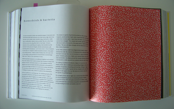
the art of looking sideways by alan fletcher

Look at this yummy, big, fat book. I love a big book full of visual goodness.

And this one certainly is. I bought this just before the grand move(s). And then it just ended up on the book shelf. I've gotten it out and placed it on a white table in my office where I intend to read and enjoy a couple pages every day.
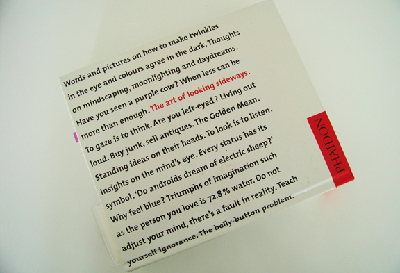
The Art of Looking Sideways is a primer in visual intelligence, an exploration of the workings of the eye, the hand, the brain and the imagination. It is an inexhaustible mine of anecdotes, quotations, images, curious facts and useless information, oddities, serious science, jokes and memories, all concerned with the interplay between the verbal and the visual, and the limitless resources of the human mind. Loosely arranged in 72 chapters, all this material is presented in a wonderfully inventive series of pages that are themselves masterly demonstrations of the expressive use of type, space, colour and imagery.

This book does not set out to teach lessons, but it is full of wisdom and insight collected from all over the world. Describing himself as a visual jackdaw, master designer Alan Fletcher has distilled a lifetime of experience and reflection into a brilliantly witty and inimitable exploration of such subjects as perception, colour, pattern, proportion, paradox, illusion, language, alphabets, words, letters, ideas, creativity, culture, style, aesthetics and value.

The Art of Looking Sideways is the ultimate guide to visual awareness, a magical compilation that will entertain and inspire all those who enjoy the interplay between word and image, and who relish the odd and the unexpected. -Phaidon

Alan Gerard Fletcher (27 September 1931 – 21 September 2006) was a British graphic designer. In his obituary, he was described by The Daily Telegraph as "the most highly regarded graphic designer of his generation, and probably one of the most prolific".

The Art of Looking Sideways by Alan Fletcher

If you are interested there is a link for this book on the right.

free font of the month...

This month's new font is Fondly Yourz. A hand drawn serif font. I always think of serif fonts as serious and this is a not so serious one. I like the thick and thin of the letters. I am sort of into alphabet fonts at the moment... all hand drawn of course. A couple more are in my head fighting to get out. Since the weather is finally nice where I live I thought I should pick a Summer-like font for this month's free font. It looks nice with Fondly Yourz. Click on the link to the right to download and enjoy!

And here is a sneak peek at Yoga Studio which will be next month's new font. This one is drawn by my friend and new font designer yogini Nancy Michaels. I think if I twist her arm she will blog here on font friday about how she is making this font.

Until then... enjoy Summer, it is always way too short. See you next month with Yoga Studio... and another free font of course...

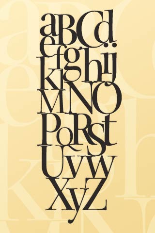
font friday... ikea alphabet poster

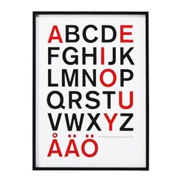
If you need some font fun for your office try this new Olunda framed poster from IKEA. I would love to have it but it is too big for my small space, not that I didn't walk around wondering where it could go. It is 26.75 x 36.5. But I do like the crisp no-nonsense look of it. I like the fact that the vowels are in red and the additions of the Aring, Aumlaut and Oumlaut for Swedish use.

And using the WhatTheFont program I identified the font used as Gothic 725 Bold.

font friday... ransom letters

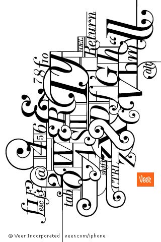
How fun is this iPhone app? You take a photo or use one from your library and type some copy and shake your phone and it adds the type. It you don't like the letters shake again. Easy and intuitive.

I got the 99 cent version but there is also a free version called Ransom Letters Lite. I think the difference is that the paid version allows you to also put type on a landscape shot in addition to a portrait one.

(Thanks Laurie!)

font friday... what the font...

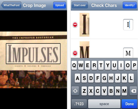
What The Font is an iPhone app from myfonts.com. And it is free and you get it through iTunes. Myfonts.com is a great company that has sold my fonts for 9+ years. What The Font is an app that is on their website and it where I always start when trying to figure out what a font is. And now there is an app so you can do it on the fly using your iPhone.

I thought the reviews were mixed but that may just be that people aren't really familiar with the app. I've used it online with good results and had equally good ones on my iPhone. And maybe people don't understand that there are tens of thousands of fonts. So the fact that there is an app like this at all amazes me. In the old pre internet days you did this kind of research by looking through books or hunting down the designer and begging them to tell you what the font was.

First you take a photo of the font in question. You crop it by tracing around it with your finger. Take a good picture with as much contrast as possible. Have no extraneous details in it. The app then decides what the letters are. If it thinks a I is a 1 you correct it in the box to the right.

Eventually it gives you suggestions. Some good, some less good. I find that has to do with how much of the type you can include in your photo. I almost always can find what I am looking for. But there is always the possibility that the font you are looking for is not in digital form. So there are reasons why this tool may not work. But when I compare it to the years of searching through books or asking other designers I think it is kind of amazing.

font friday... free font of the month!

2 fun fonts for June! This month's new font is Paris Doodles. Lots of little Paris drawings. It was nice to armchair travel back to Paris to create this font. I hope you enjoy using it as much as I did making it.

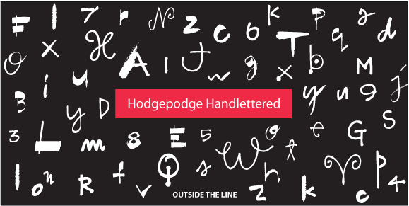
And Hodgehodge Handlettered is this month's FREE font. Lots of mismatched letters. Works nicely for a headline for an inital cap here or there. To download this font for FREE click on the link to the right.

And you have been asking for a font of cute animals... So Justine is working on Just Animals. And here's your chance to tell us what animals you need. Just leave a message in the comment section and I'll pass it on to her.

Have a great June, Summer has finally arrived! See you next month.