type tuesday... huge type for the iphone...
/ hugeType is an experiment with found type on the iPhone. You and search letters from the community, and upload your creations. Find out more.

I'm Rae. I make fonts & blog. I reside in a city on a lake but spend most of my time living in my head.
 hugeType is an experiment with found type on the iPhone. You and search letters from the community, and upload your creations. Find out more.

 I was delighted to find this website Typography for Lawyers. Butterick has even written a book on this topic. His site breaks typography down into easy to understand examples for the non-typographer. This site is very useful whether you are a lawyer or not, graphic artist or not. It is easy to understand and fun to read.
Matthew Butterick got his B.A. degree from Harvard University in visual & environmental studies, also studying mathematics and letterpress printing. His work is in the permanent collection of the Houghton Library at Harvard. Butterick started his design career at the Font Bureau as a typeface designer and engineer. At the beginning of the Internet era, he moved to San Francisco and founded website design and engineering company Atomic Vision. Atomic Vision was later acquired by open-source software developer Red Hat. More recently, Butterick got a law degree from UCLA and has been practicing civil litigation in Los Angeles. While he's not the only typographer-turned-attorney in America (or even in Los Angeles), he is the only one who operates a website called Typography for Lawyers. - Font Bureau
 NEW FONT - 30 cute cottages and homey homes in my neighborhood make up House Doodles. You can do a lot with this clip art font... change of address, address labels, open house, house warming...
FREE FONT - Cross Stitch is great font for crafters and scrapbookers. It can be used to design and layout samplers, or to just create that Home Sweet Home look. Download link is on the right.
SNEAK PEEK - yes the holiday season is just around the corner. And Yuletide is almost done.
Enjoy Fall it will go fast. Way too fast.
 PS... if you want to follow this blog on Facebook scroll down, way down and click on the Follow this blog link. Thanks!
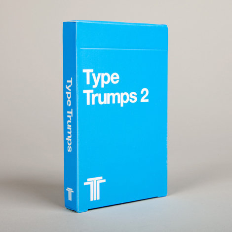
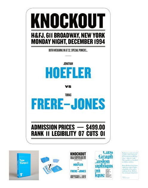 I love this set of typefaces made into cards... a cool form of advertising. I think I may get them and use them in a row on a wall somewhere.
You can get them from The Ghostly Store and they are $12.50. This is currently the only US retailer.
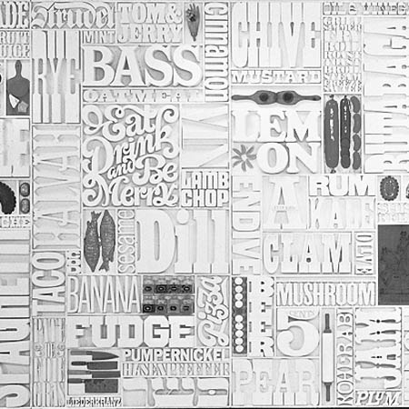
 This piece of typographical art appeals to me the same way as Michael Johansson's work does. I love how everything fits tightly together and I LOVE type from the 60s and 70s. Those were amazing visual times. And this piece is one of the best examples.
Gastrotypographicalassemblage is a 35Â feet (11 m) wide by 8.5Â feet (2.6 m) tall work of art designed by Lou Dorfsman to decorate the cafeteria in Eero Saarinen's CBS Building on 52nd Street and Sixth Avenue, New York City, New York, USA.
As the senior vice president and creative director for marketing communications and design for the Columbia Broadcasting System, Dorfsman was responsible for all aspects of the building's graphics, designating the type, design and spacing for wall clocks, elevator buttons, and elevator inspection stickers. He designed what he called Gastrotypographicalassemblage for the building's cafeteria, using varied typefaces to list all of the foods offered to patrons in hand-milled wood type. The completed work was based on ideas conceived in the mid-1960s. The project was ultimately completed in 1966 with assistance from graphic designer Herb Lubalin, and Tom Carnase, who crafted the typography from Dorfsman's original design. Dorfsman considered this work to be "his magnum opus, his gift to the world".
Gastrotypographicalassemblage was discarded in the early 1990s by CBS, but the work's nine panels were retrieved by designer Nick Fasciano. It was in an advanced state of disrepair, aggravated by improper storage. The piece was acquired by the Atlanda-based Center for Design Study, which has undertaken an effort to raise the funds needed to support the restoration of the work of art. The group's goal is to restore Gastrotypographicalassemblage and to use it in a permanent traveling exhibition focusing on historical American design, and using the piece as an example of the value of intelligently applied design. From Wikipedia
 We live in a neighborhood of charming little homes. I decided those cute houses should live on in a picture font so here is House Doodles. These have a lot of detail in them so you need to use most of them at a larger size as a piece of clip art. Some of the simpler ones can be used at a smaller size.
And this was the song running thru my head in my early mornings when I was walking the neighborhood with my camera... but in my neighborhood the houses and the people are not all just the same.
 Both fonts this month are the creation of Justine Childs. This month's NEW font is Just People... 36 faces of people you probably know... I see my friend Ann and my Uncle Ray... Click here to see the whole family.
 And the FREE font... Just Christmas... here is a sampling of some of the Christmas icons... get an early start on your Christmas projects with this fun little font. Click on the download link on the right to get this font.
 And a Sneak Peek... next month's new font will be House Doodles... I'm about half done and can be found at dawn skulking around our neighborhood with my camera...
Enjoy the last days of Summer. I just heard that it will be a warmer than usual Fall where I live... I am going to enjoy every last minute!
 And if you are on Facebook and would like to follow this blog there you can just by clicking on the NetworkedBlogs box on the lower right. Scroll down, way down.
I'm Rae. I make fonts and blog. I reside in a city on a lake but spend most of the time living in my head.