font friday... woof!

Big dogs, little dogs, some silhouettes, some not, drawn correctly and given the feel of their own breed. 29 dogs (1 mutt) and a paw print.

Nancy drew this font and I was amazed at how each dog was that breed. I think she did an amazing job researching and capturing the essence of each dog. She even had a dog committee to critique her dog drawings.

If you are a dog lover or run a kennel or need a dog for your personal stationary THIS is the font for you.

Nancy drew the Yoga Studio font and Woof. If you have a need for a font in her style drop me a line with your suggestions.

Just FYI... Woof and any other Outside the Line fonts are available as webfonts. You can find them at FontSpring or MyFonts.

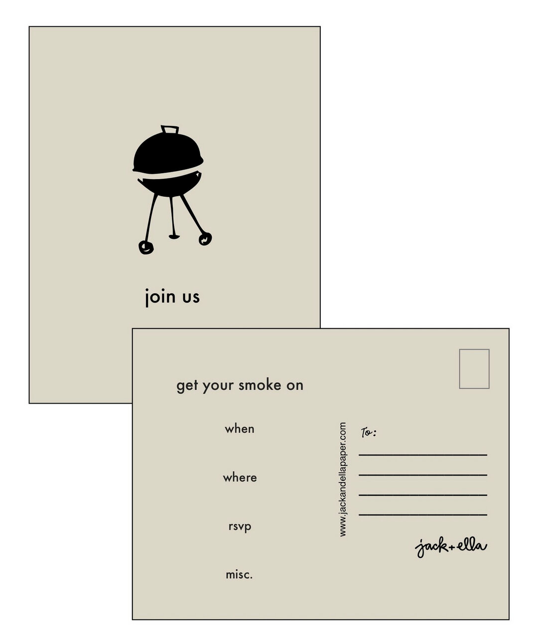
Unique Business Stationary

indesign tip...

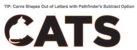
Who doesn't like a good tip, especially one that has to do with typography. InDesign Magazine has a Tip of the Week. The current one shows you how to carve vector shapes out of letters. And you can also sign up for their Tip of the Week newsletter.

Click here for a 7-day free trial to lynda.com

typodarium calendar 2012...

Two of my fonts have been accepted for inclusion in next year's Typodarium page-a-day calendar. Fondly Yourz above and Cordially Yourz below. Both fonts are from the Love Letters Series. I also have fonts in the current 2011 calendar and am enjoy seeing a new font each day.

font friday... drop cap #1... sneak peek

ere is a peek at what I have been working on this month.... Drop Cap #1. It has been great fun. And lots of good creative thinking. This is a Drop Cap font or an Initial Cap font. Even though it has all the letters of the alphabet it is not an alphabet font to be used for headlines or god forbid body copy. Plz don't type people's names in it either, it won't be pretty. It has no kerning or punctuation except a period which I am actually putting in against my better judgement. But it will have accent marks for all of you who do not live in the states.

There are basically 2 alphabets here. The lighter letters are lower case and the darker letters are upper case. The light and dark letters are interchangeable. I usually try to pick one that relates to whatever I am writing about. I really made these to have a set of initial caps to use on my blog. Eventually these will be sold as web fonts too.

This is to be used with one lovely cap all alone with body copy. A perfect example is how I started this post with the nice H. Now you do need to have a program that allows you to wrap copy. And you do need to know how to do that in your program. But none of this is hard to figure out.

Drop Cap #1 may be up for sale here by this time next week... in the mean time have a great weekend!

gift certificates...

I was just asked if I do Gift Certificates and well, of course I do. So if you are looking for something for your favorite graphic artist who likes my work we can make a gift certificate happen. I do sell my fonts through other sites but since you would be paying me (and I take PayPal) the person getting the gift will also have to buy through my site. I have several package deals... 3 fonts for $49 and 6 fonts for $99 and of course 1 font for $29. Use the CONTACT link in the menu bar above to email me.

font friday... free font of the month!

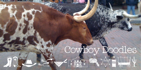
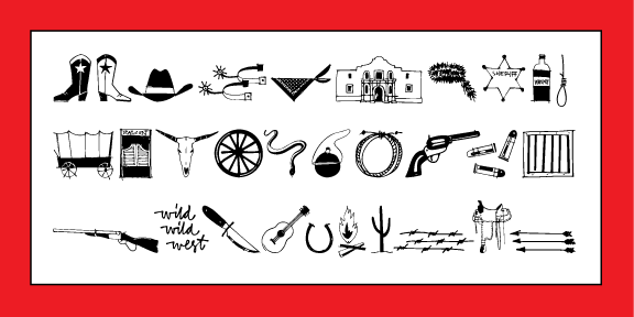
Lots happening here at Outside the Line... this month's NEW font is Cowboy Doodles. For all of you who live in Cowboy land do check it out.

This month's FREE font is Doodles the Alphabet Black. A fun hand lettered font that works well with all of the Doodles fonts. Use the Download link on the right to get it for free.

Here's a little Sneak Peek at some upcoming fonts. Next month's font will be one of the two,  both are progressing nicely.

QUESTION: What City Doodles would you like to see? They would follow the theme and look of Paris Doodles. I've had requests for London Doodles, a tropical doodles, a sailing and lake vacation doodles.

Leave a comment and I'll give it some thought. And Happy Spring, I think it is almost here!

shady characters... the secret life of punctuation

For all of you type, grammar and punctuation nerds here is a new site... Shady Characters.  Keith Houston’s blog about the unusual stories behind some well-known — and some rather more outlandish — marks of punctuation. He has finished a 3-part post on the Pilcrow (pictured) and I am looking forward to the upcoming series that features the Interrobang.

font friday... cowboy doodles font

As a kid I watched Westerns, had a cap gun, chaps, spurs, cowboy hat and my favorite black and red cowboy boots. That and a trip to Texas was the inspiration behind Cowboy Doodles. For all of you who live in cowboy country or want to check it out here.