font friday... free font of the month!

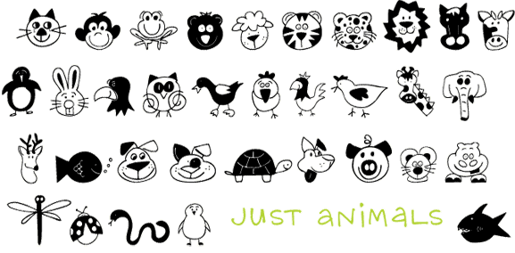
A NEW font to start the year off right. Just Animals was drawn by Justine Childs and is the cute animal font that you have been asking for forever. And the FREE font is Justine's too... Just People. If you look closely you'll probably see people you know... I see my friend Ann, my Uncle Ray, my Aunt Audrey...

See the DOWNLOAD link on the right to download the FREE font.

And in 2011 you will see the free font of the month club but not at the first of the month and maybe not every month. But then you may see it more than once a month sometimes. It just all depends. I've decided since I am the boss that I am going to enjoy the luxury of not being driven by a time table. I have lots of fonts in my head and some that I know will take more than a month. An alphabet font always takes me longer and I seem to have a lot of them waiting to be drawn. So you will hear from me when there is something new. But of course there is always something new on the blog... 5 days a week and that will continue. So check back often and see what is up.

And Happy NEW Year!

milton glaser: to inform and delight...

Milton Glaser: To Inform and Delight

2009NR 73 minutes

His name might not be very familiar, but the works of graphic artist Milton Glaser -- whose prolific output includes the "I Love NY" ad campaign, as well as album covers for Townes Van Zandt and Nina Simone -- are recognizable to many. Revisiting the famed paintings, drawings, logos, prints, posters and other works by Glaser, filmmaker Wendy Keys creates a rich and engaging mosaic of a key figure in American iconography. - Netflix

I am of course familiar with who Milton Glaser is. Both John and I found this documentary to be great fun and of course a flash from the past. The '60s and '70s we such a visual delight. Glaser is so talented and interesting and such a visinary. This is a must-see for all graphic artists, or those in advertising. I enjoyed this as much as I enjoyed Art & Copy.

This is correctly titled as it did inform and delight!

type tuesday... beautiful handwriting from 1916...

Our neighbor Ellie gave me this postcard. It was sent to her Aunt in 1916. Her Aunt was an opera singer and traveled the world. Olivia Monona was her stage name and from the sounds of it lived a very interesting life.

I am very interested in A.M.H. who penned this little message. I assume the writer was a woman because of the feminine look of the lettering. But maybe she was writing this for someone else, who knows... As someone who makes letters for a living I am so intrigued by this. The lines are even thinner on the original and so very delicate. They would have been drawn with pen and ink and a very steady and talented hand.

I can only assume that to have had this training and time to learn this in 1916 you would have had to have been somewhat wealthy. The sad thing is to see this skill level and at this time this would have been how you would have used this talent. A.M.H. could have designed beautiful typefaces if she lived now. I wonder what her life was like and how she met Ellie's Aunt.

(Thank you Ellie, I'll treasure this. As you know I love things like this.)

just animals... new font

You have been asking for this font Just Animals and here it is. I've had requests for cute animals and Justine drew them for you. I hope you like them. They would be fun to use when scrapbooking or for making Punky's birthday party invitation.

type tuesday-d.i.y. modpodge box...

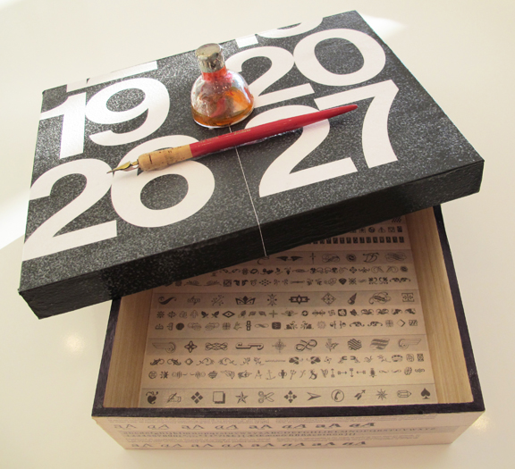
I like making these mindless modpodge wooden boxes. I made a Paris one and a button one. I like making them out of stuff that is laying around that I have collected.

I get my boxes at Michael's. They are cheap but not always smooth. Since I cover almost the whole box with ephemera that is fine. This one is 9.25 x 12 and will live in my office to hold all those papers that I can't quite part with yet. When the box is full I will sort and toss and start over.

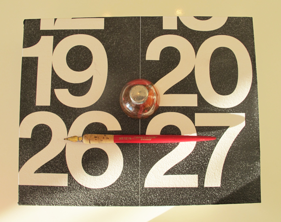
I used an Emigre font sample book from many years ago for the bottom of the box. And part of a page from a really large calendar for the top. The ink bottle I found many years ago in a junk shop somewhere and the Koh-i-noor pen was from my art school days.

I got a new small sander and think that I should sand the boxes first. It would make the gluing process a little smoother. All in all I am pleased with the end result. And anything that give me a place to put paper is good.

Maybe some year I will make boxes for people as gifts. It would be fun to try and make a box to suit a particular friend. And then put something special inside as a little surprise.

i am a creative character... at myfonts.com

OK I admit this is a bit of shameless self-promotion, but I am the November Creative Character on myfonts.com. I am humbled and awed to receive this honor and be included in the ranks of these amazingly talented font designers. (Eric Gill is there and Stuart Sandler.) So if you don't already know more about me than you would like to you can click on the links provided. And Happy Thanksgiving... we all have much to be thankful for.

why i am a type designer... U&lc...

I started getting this magazine when I was in school learning to be a Commercial Artist. I have the exact same reaction seeing this page as I did getting it in the mail all those years ago. I swoon. This is so well designed. I studied it for layout, color of the page (light and dark), graphics and of course type. I think I initially got this free as a student and then subscribed for years. In the beginning it was a lovely large tabloid size. Jump ahead to Rochester, Minnesota. I am sitting in the parking lot of a strip mall where I am searching for queen sized mattress pads for 3 new beds that will be arriving to our new house shortly. I am in a town I didn't choose in charge of things I don't want to be in charge of like mattress pads. John is building a TV station from the ground up. I am opening the mail while waiting for the store to open and I find that I have received honorable mention in the U&lc's (I think first and only) typeface design competition. This is 1998. I had been playing around with Fontographer and had made 2 fonts. I had submitted Doodles my second font and won honorable mention and $200. I ran home to do some research. There had been 2 first prizes and 2 honorable mentions in 3 categories with entries from around the world.

I decided to take that as a sign that I should make fonts. And 60 some fonts later that is what I do.

My yellowed  back issues are long gone but thanks to Fonts.com they have now been scanned and are available for all of you to enjoy free of charge. Check here.

If that isn't enough U&lc for you I also have the book... link to the right if you are interested.

(Thank you U&lc I wouldn't have done it without you!)

type tuesday... helvetica vs. arial...

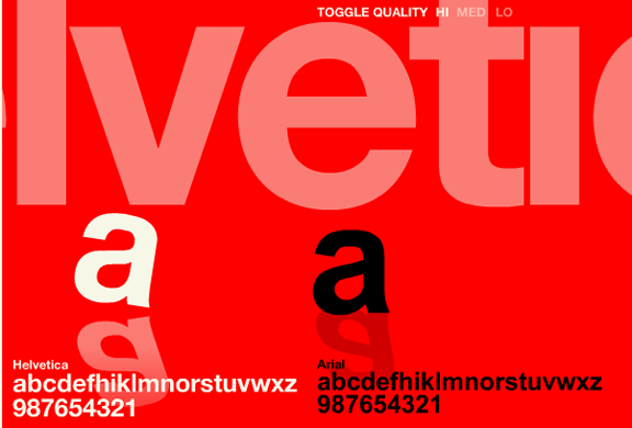
I know some people don't like Helvetica. But I love Helvetica because it is so well crafted. It is a beautiful typeface. While I think it may be over used that does not in my mind take away from the fact that good design is good design.

Helvetica was created in the 1950s by the Haas Foundry in Switzerland. Microsoft later created Arial which is similar. I just never think a knock-off of anything is better. But Arial comes bundled with all computers. So Arial is used more than Helvetica...

So if you feel strongly either way or just like a little font fun you can play the helvetica vs. arial font game...  enjoy!

(Thanks Laurie for passing this on!)